Date-Time Picker
a redesign of date picker component.
What I did
- Role:
UX Designer, Developer - Date:
July 2017 - September 2017 - Prototyping:
Sketch, Framer.js, HTML/CSS
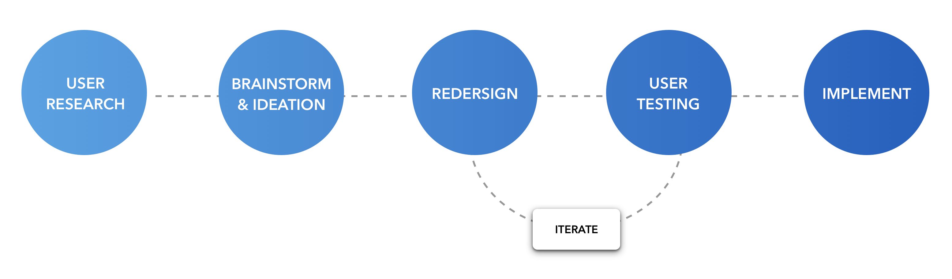
During my 3-month internship with INRIX, I was tasked to redesign an interactive date/time picker that enables a user to compare traffic at different days and times. This benefits a client in helping them to personalize traffic data to show only what they are interested in. I used the human-centered design process throughout to make sure my designs were meaningful for our target audience.
My process began by conducting 5 task-based usability studies to uncover current product issues. I then used that feedback to target the redesign of features and task flows, which were then put to a second round of task-based user testing. The outcome resulted in more intuitive features to help a user achieve their goals, as well as a completely new visual design.
Existing issues.
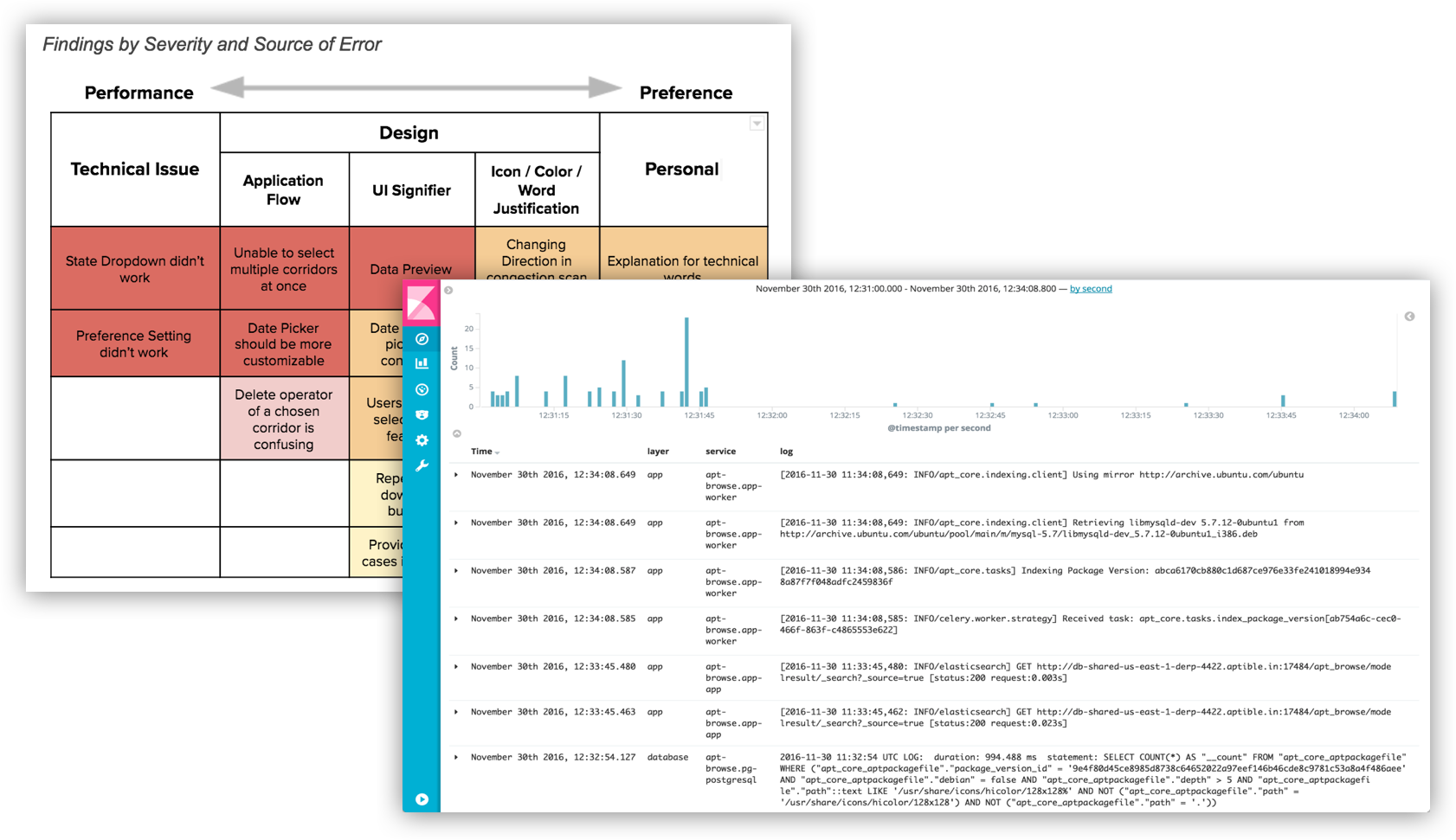
I started this project by conducting the usability study included remotely interview and observed the application walkthrough with 5 INRIX customers. Based on the usability study, the current date picker components had serious usability issues and high drop-off rate. So, the first thing I did was to understand Why the current date picker feature couldn’t satisfy our users' expectations? What did the users actually need? and How could I design the feature to improve users’ satisfaction?.
Usability Issues
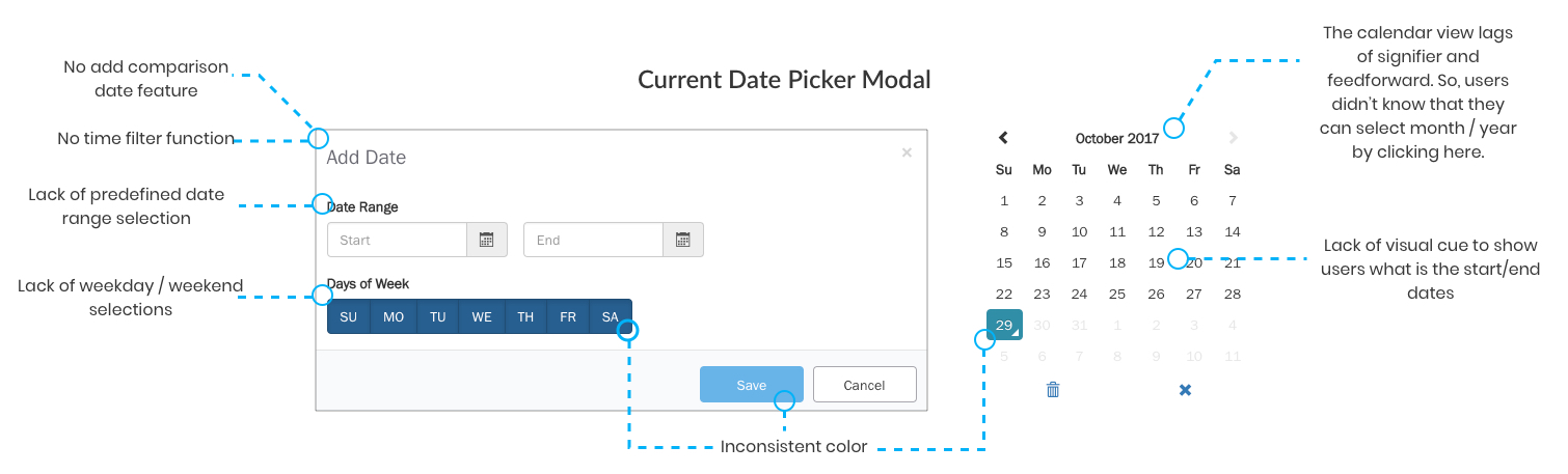
Navigational Issues
Opportunities
- Help users personalize traffic data they want to visualize, analyze, and download.
- Reduce time on task that user need to spend on choosing and filtering data on date picker.
- Reduce company’s cost on bandwidth
Design Process.
User Research.
Usability Study & Database Query Log
User Needs
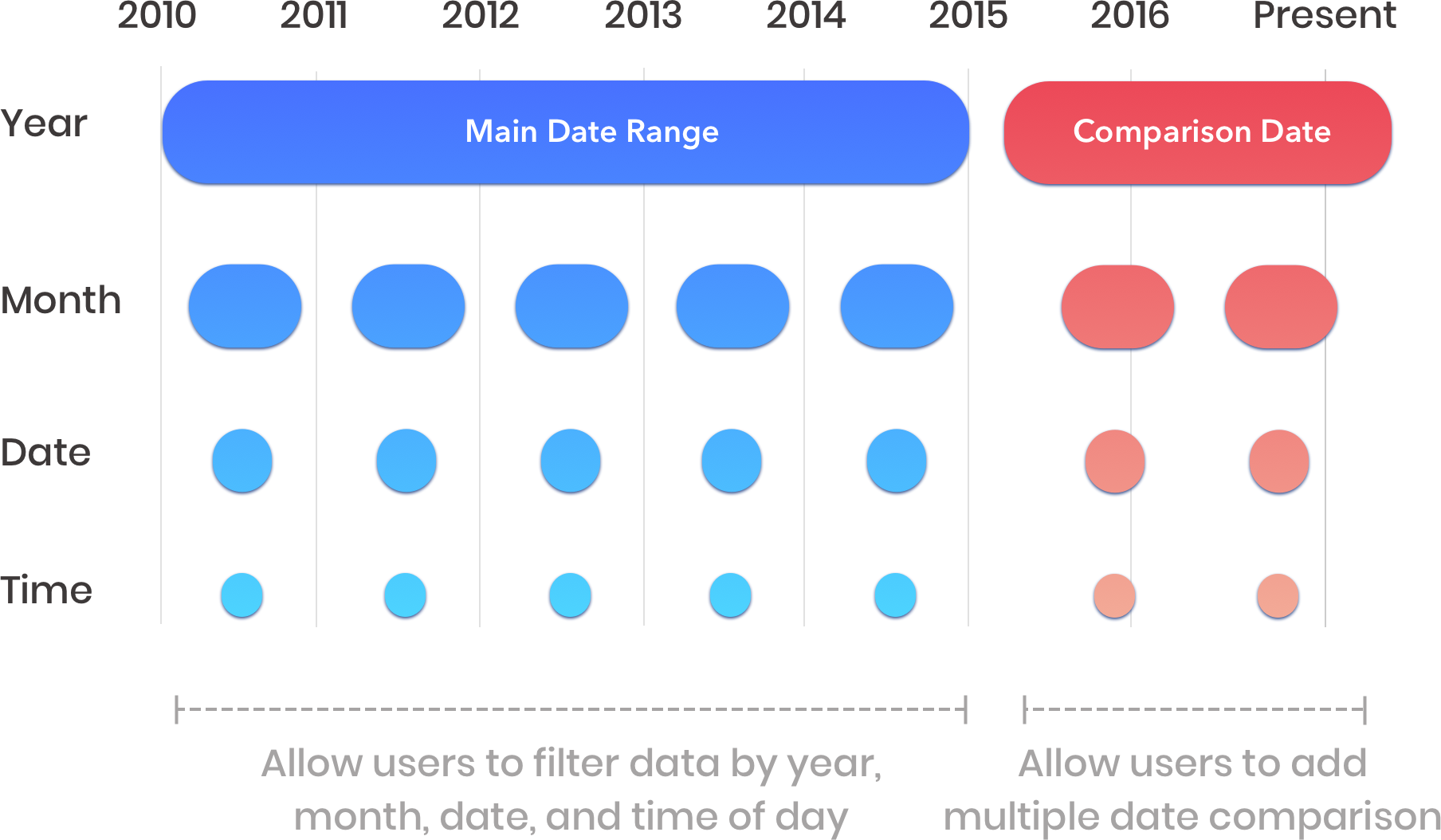
Based on the insights from user testing and data from google analytics, users wanted to select, visualize, and download the traffic data in the specific date and time. The most common use cases of date picker components were:
- Users wanted to select the data from the same specific months in 3 or 4 consecutive years to compare.
- Users wanted to be able to select date range from predefined options e.g. 7 days, last week, last months,last year.
- Users mostly categorized the data between weekday or weekend.
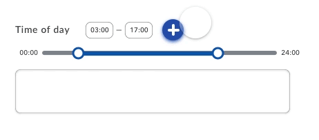
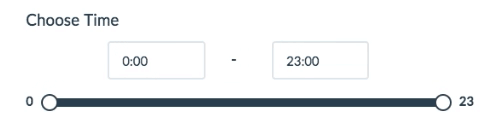
- Users wanted to be able to focus on specific time of day.
- Users wanted to add the multiple date range for comparison.
Design Consideration.
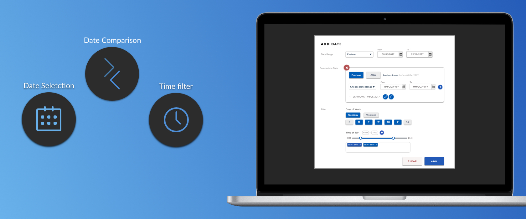
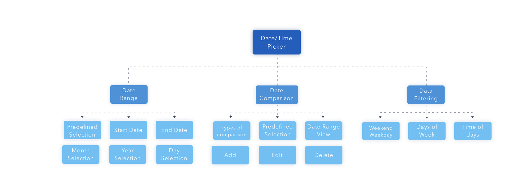
Based on the data I gathered from the user research and the product road map, there were three main components that can help users achieve their expectations including date selection, date comparison, and time selection. Here are the design consideration that we need to consider for date picker feature.
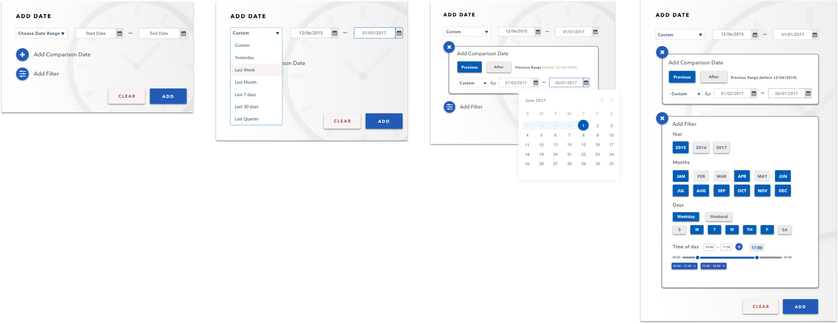
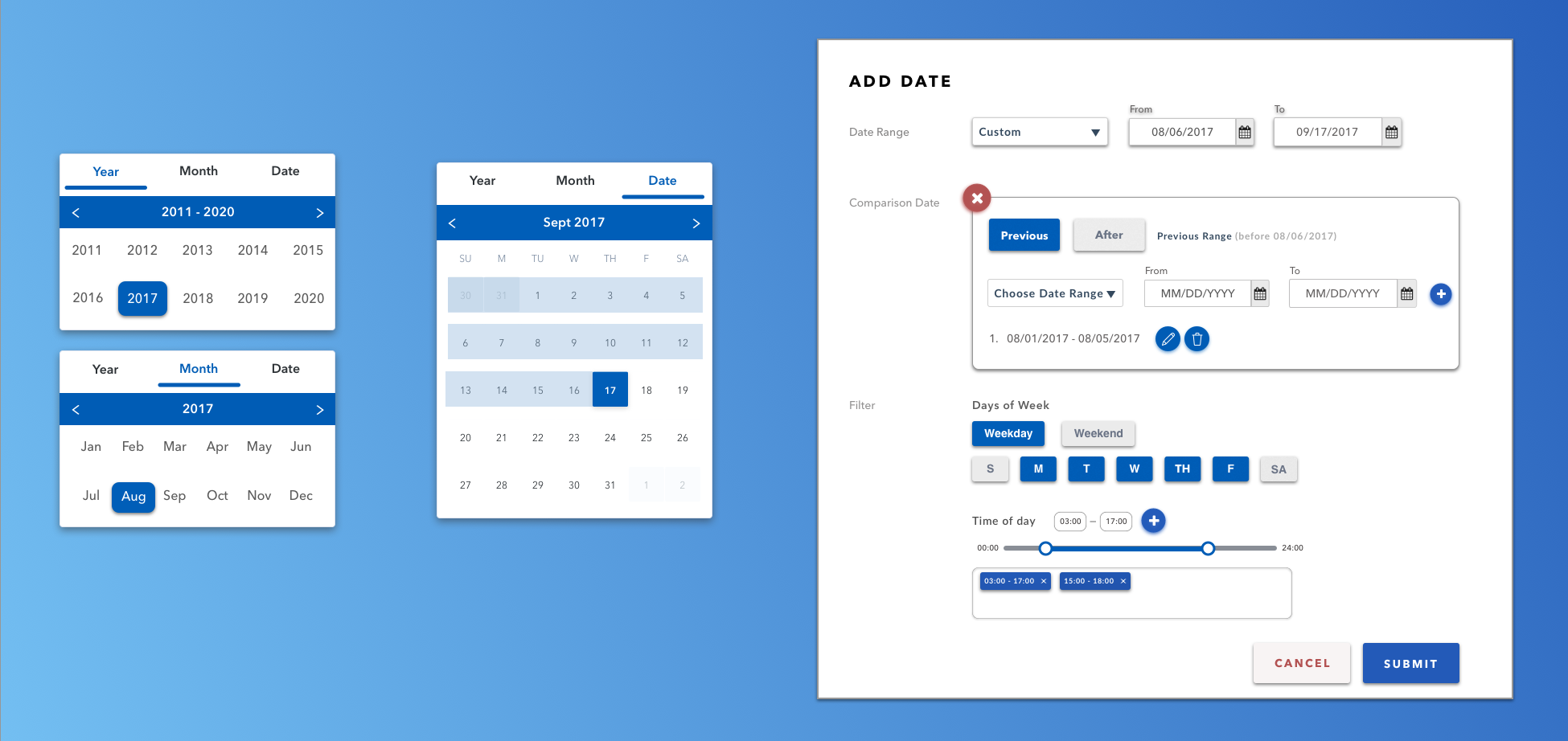
1. Date Range Feature
- For calendar view, provide visual cues and feed forward to show month and year options.
- When users click on the calendar view icon, start date, end date and date range needs to be displayed in a clear manner.
- The predefined value should be consistent with users’ expectation based on users data.
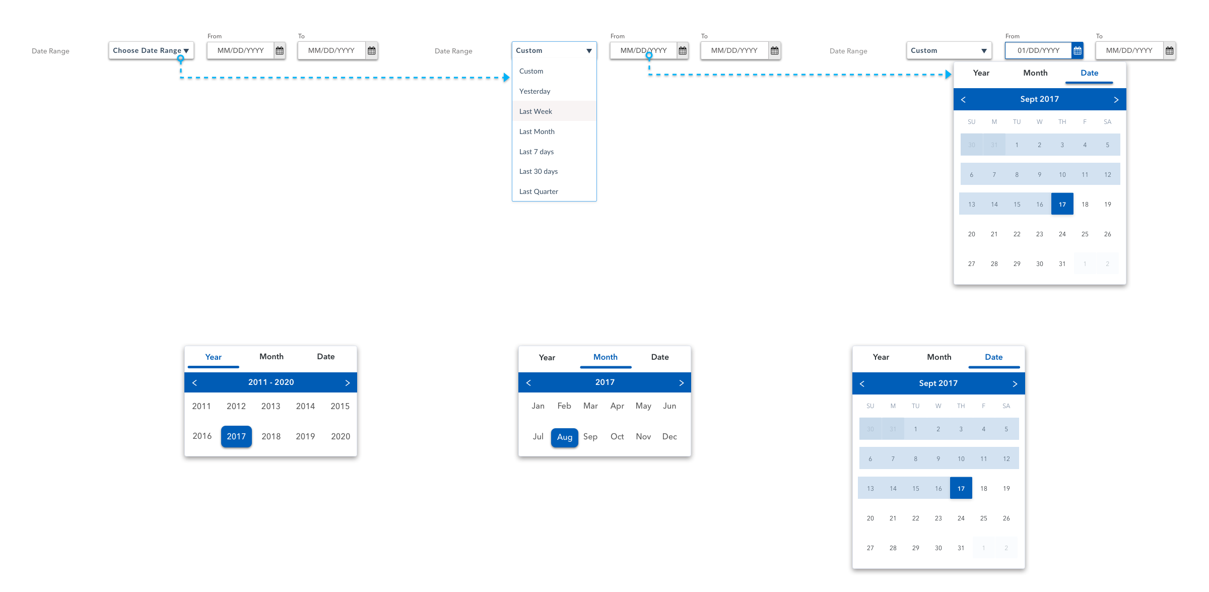
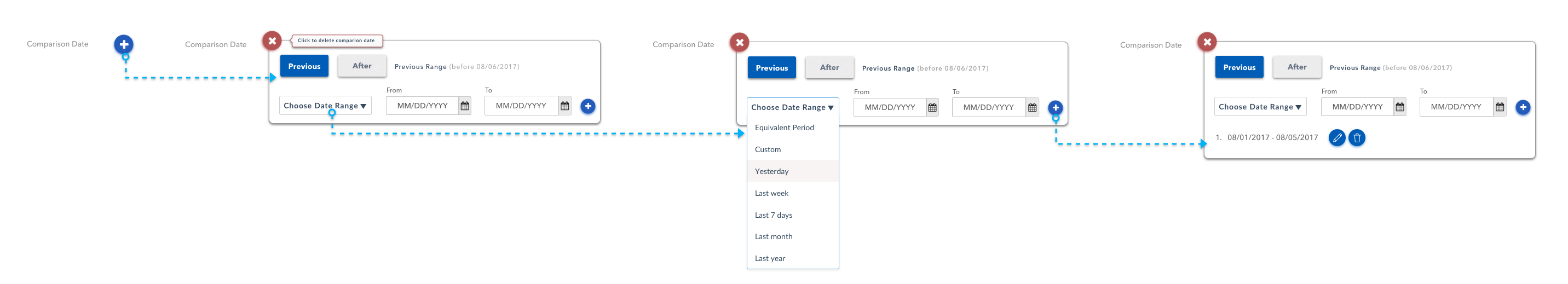
2. Comparison Date Feature
- Provide users with predefined date range feature mentioned above.
- Enable users to add, edit and delete multiple date ranges.
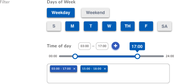
3. Data Filtering Feature
- Allow users to filter weekends, weekdays or a specific day.
- Allow users to add, edit and delete multiple time ranges.
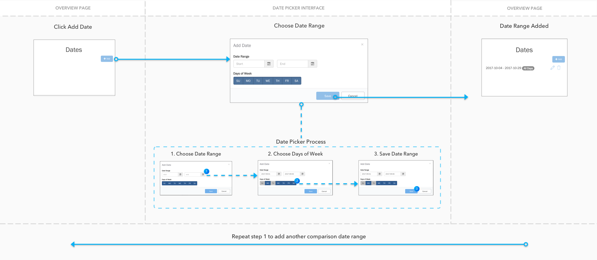
Information Architecture.
I started the redesigning process with a meeting with design and engineer teams to discuss existing issues and brainstorm potential features. We created the design specification for a new date/time selection. We listed down all features that corresponded to our analytic features and matched with the users' intent in order to help them achieve their goals of using this application. Here is the information architecture based on the design requirement.
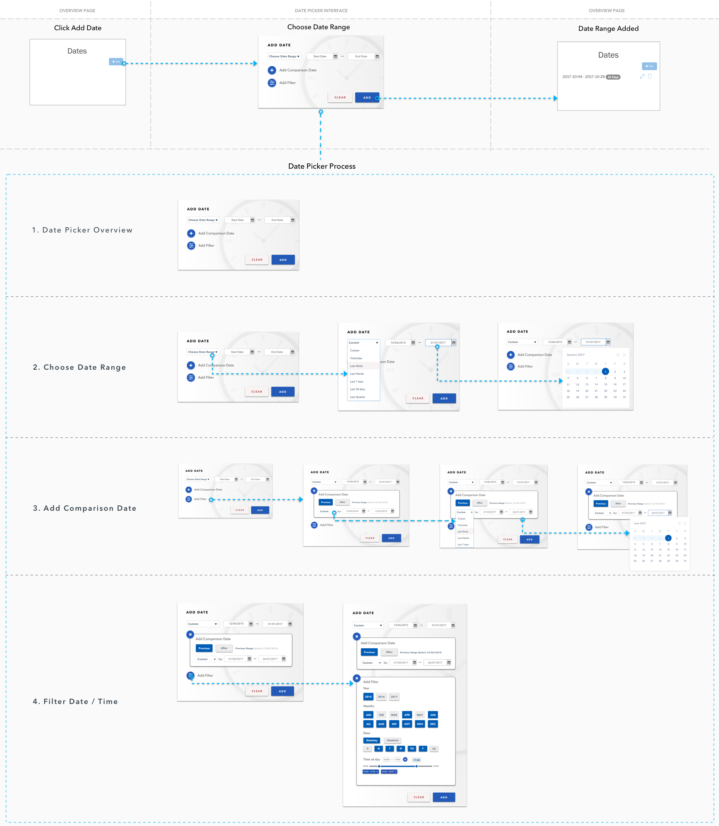
1st Design Iteration.
Wireframe.
Interaction Map.
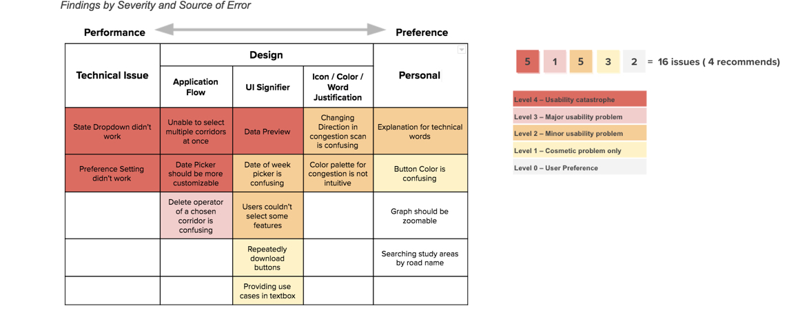
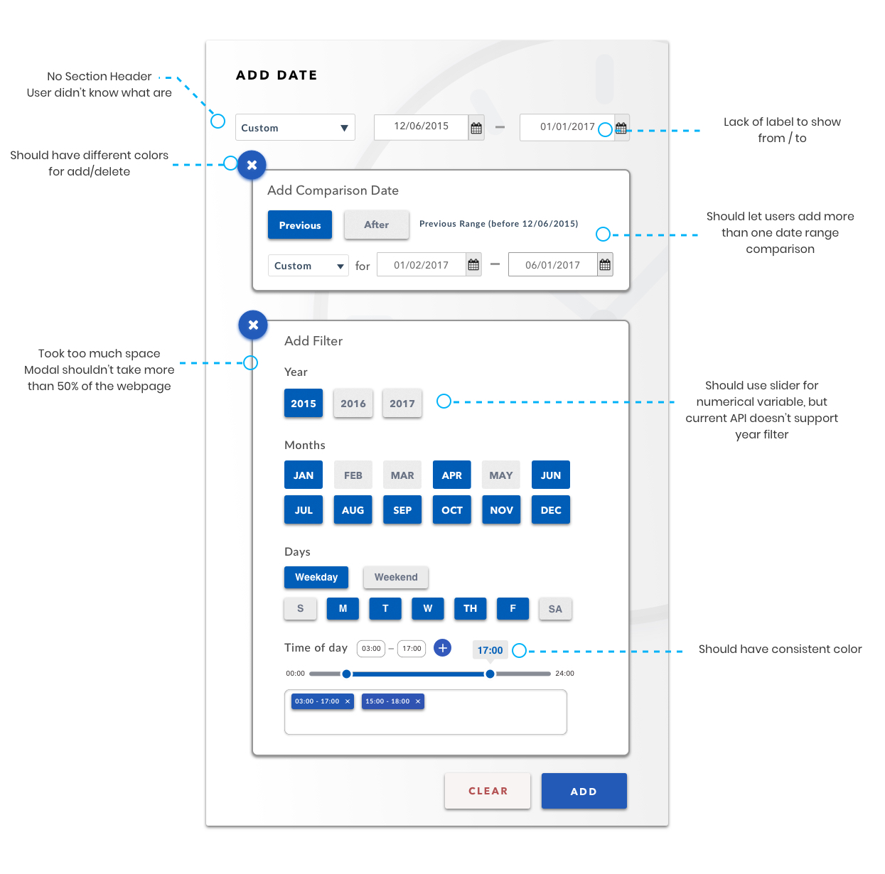
User Testing I.
I conducted user text with 6 employees from INRIX. 3 of them don’t have any experience with Roadway Analytics. The other 3 interact with Roadway Analytics on daily basis. Here are the results of user testing:
2nd Design Iteration.
Redesign UI.
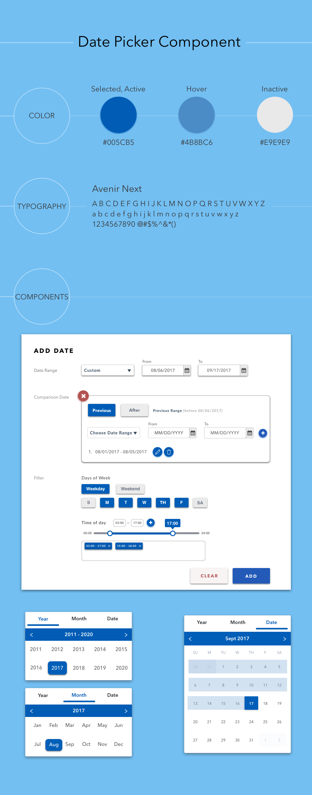
Interaction Map.
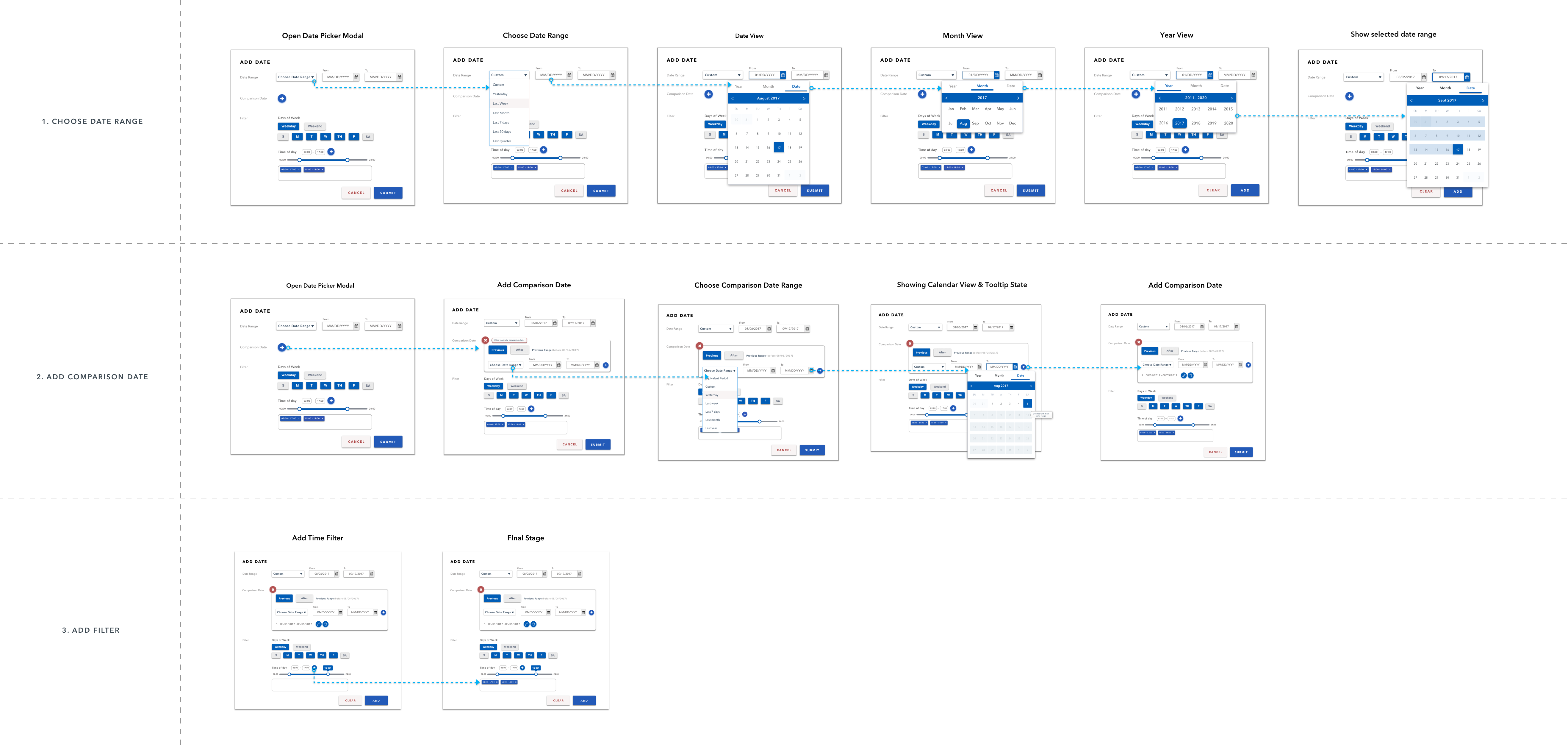
Interaction Design.
Using Framer.js, HTML, and CSS (SASS), I tried different interaction methods for the element pressing and adding transitions.

Final Deliverable.
Reflection.
Key Learning.
- Simplification is not always the best way to go. Users might prefer more complex application or feature that has a higher learning curve that can give them more flexibility and help them achieve what they want. [ Tips: Dont forget to add default settings for users!].
- Always opening yourself for a new opportunities outside your area of responsibility. I It can lead to something meaningful and impactful.
- The product for the end user experience you have to make it as intuitive as delightful as possible but when it come to enterprise maybe there is big learning curve and big jump to know the product but as long as it’s learnable and user achieve their goals they have.
What would I do differently?
- Get More data from users. Conduct more user testing on the high-fidelity prototype to get more feedback from users and do one more iteration [focus on layout organization and interaction].
- Dive deeper into user needs to understand their motivations. Consider alternative approaches to address the problems.
- Try to look at the project as a combination of the small elements. When one part didn't workout due to any kind of issues, the other parts should be able to work and the application should still be ready to launch. [Always have a back up plan when work didn't go as we expect.]
Next Step?
- Measure and analyze the time that users spend on date picker and the bandwidth usage that company has to spend on data downloader for this application. (reduce the size of data that users can download).