What I did
- Development:
Python (Tornado), Mapbox, Crossfilter, D3 - Database:
PostgreSQL, PostGIS
Project Goals
Hazard Dat displayed the location of tornados, extreme winds and hail, through visual spatial representation. It provided instantaneous information for a user, who may identify a specific location or date in their search. Hazard Dat provided answers to individuals in extreme conditions, to their loved one’s seeking information, or simply to those inquiring about the current weather conditions. The desired outcome of Hazard Dat was to identify the spatial patterns and vulnerable locations of severe weather conditions.
Approaches
I created a series of maps to observe travel pattern of people from different income and race groups. I used a black base map to show contrast of area and spatial acitivities.
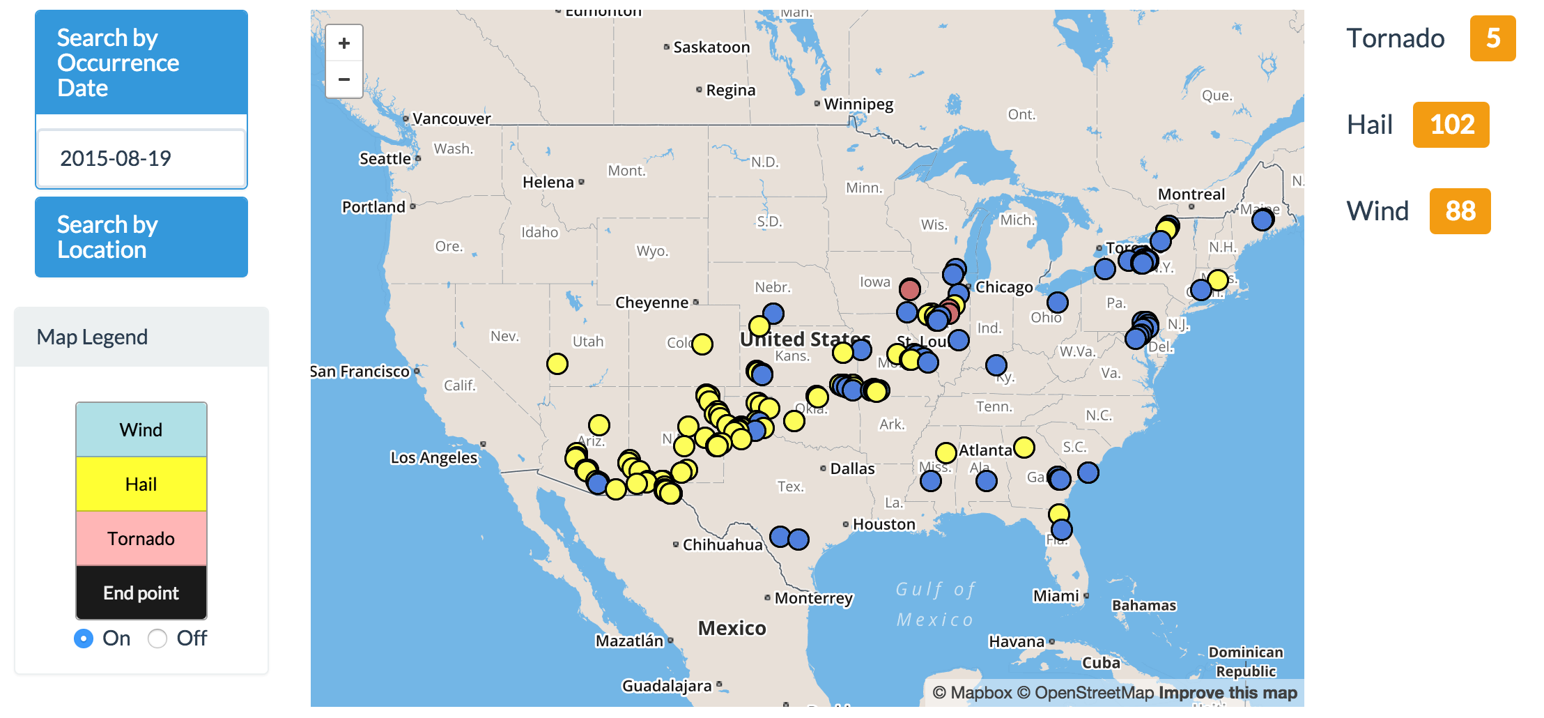
Data was retrieved from the National Oceanic and Atmospheric Administration (NOAA) of the United States Department of Commerce (DoC) and organized in PostgreSQL; an open source object-relational database system. PostGIS spatial analysis was used to determine the density of hazards in a specific area, as well as between two selected geographic locations (x,y).
Challenges
For data processing, it was difficult to obtain hourly weather variables
because a lot of
weather station didn’t collect hourly weather data. So, I needed to run the downgrade time
series analysis with the daily weather data with the existed hourly data. Moreover, weather
event was a continuous phenomena but data is isolated to an observation site. I calculated
and applied the most accurate spatial interpolation techniques to estimate the weather
variables geographically. Moreover, the data was collected in 600 gb separate hdf5 files
which were not downloadable and analyzed in my local machine. So, I used AWS to analyzed and
converted the data into InfluxDB time series database.
For product design process, this application was built to support transportation planners
and climatologists. I have conducted the interview with several traffic planning
specialists, climatologists, and geographer for choosing the right visualization tools to
effectively show each traffic element. There were several attempts on exploring which type
of chart that was suitable for capturing the overall trend and comparing spatiotemporal
trend of traffic volume. After conducting the user test, Calendar heat map was the best
visualization tool that can help all stakeholders analyzed and understand the trend
easily
Reflection
- Do not make assumptions about the needs of the users
- Choosing the right encoding method to represent the spatial phenomenon is really important. Wrong choices can eventually lead to the misinterpret of information and cause server damages especially in this case when it related to fatal events.
- Although climate phenomenas are continuous events, all climatology information was collected and encoded in point formats. So, we must take spatial interpolation into account before conducting analysis or creating climate-related visualization platform.