Mapsenger
Realtime map-based messenger.
2 Awards Winning & Funded by UW Foster School of Business
What we did
- Team:
June, Jihoon - Role:
UX Designer, Developer - Date:
Nov 2016 - Apr 2017 - Prototyping:
Sketch, Origami Studio - Coding:
JS, React, Redux, Mapbox, PubNuB
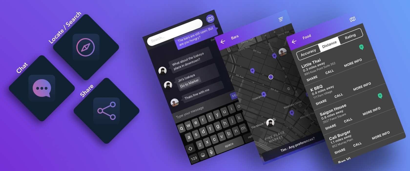
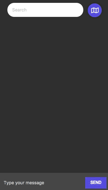
Mapsenger is a map-based instant messaging application that allows users to discuss, search, and share information about places to meet and activities to do. This app eliminates the pain points of having to alternate between messaging and map apps by having everything you need to arrange a hang out built right into the same system.
For this project, my main contributions were creating information architecture, designing interactive prototypes, conducting the usability test, and implementing the application.
Awards
- 2018 UW Business Plan Competition Prototype Funding
- 2018 UW Science and Technology Showcase Best Poster
Existing Issues.
when meeting with friends, choosing a mutually ideal location for everyone requires constant switch between multiple mobile applications that provide functions such as navigation service, curated review service, and social network service. This is because the such decision-making process requires multitudes of geospatial data among all members.
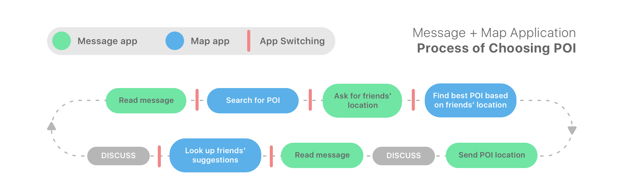
Solution.
We propose Mapsenger, a mobile application that aims to provide streamlined decision-making process among friends. Mapsenger is a map-based real time messaging application that allows users to discuss, search, and share places to meet among a group of nearby friends. This application features a delightful fusion of chatting and navigation apps, by applying the use of communication channel, spatial search engine, and visualization to improve the experience of decision making among users with contextual geospatial data.
Design Process.
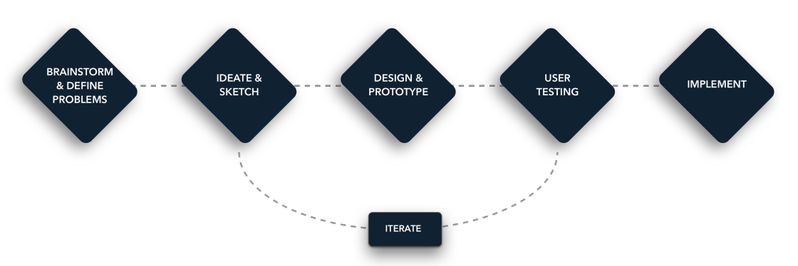
Brainstorm.
From that point, we started to discuss the pain points in transferring the information between the messenger and map. In order to solve this problem, we decide to integrate communication feature, search function, and places information into the same app. As a team, we brainstormed potential solutions.
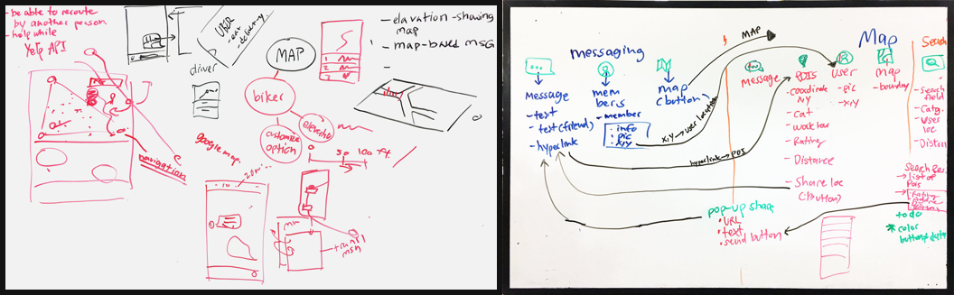
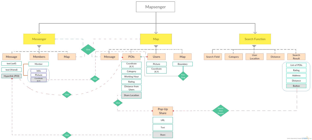
Designing Information Architecture.
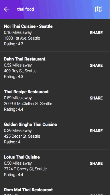
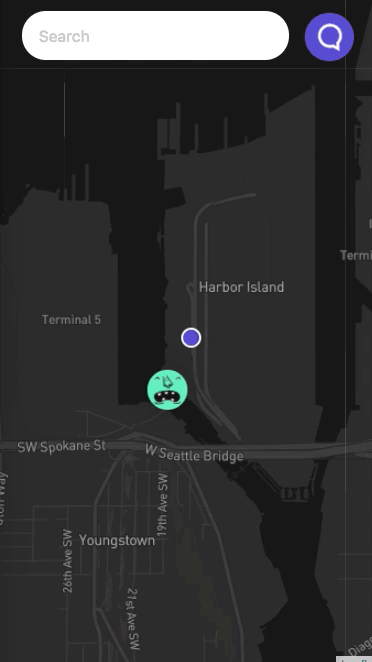
Our goal was to create a simple user centered design application that minimizes the user's workload when sharing spatial information. We decided to add only core functions included chat, location search, distance calculation/visualization, location sharing, and information of Point of interests (POIs).
Designing Behavior Flow.
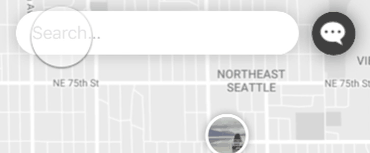
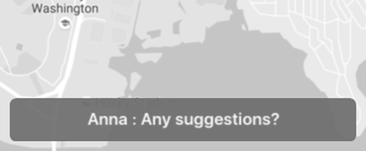
Based on the information architecture, Mapsenger composites of three main components chat, search, and map. We decided to put messenger at the initial screen to help users chat and get more information before searching the places. Then, users can browse, choose, and share the information of their POIs to their beloved ones by a simple click on a marker.
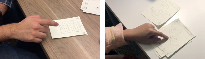
Paper Prototype Usability Test.
We iterated our wireframe design by conducting informal usability testing with the low-fidelity prototype. Our participants provided feedbacks on error-prevention methods, accessibility, and discoverability of the UI. Participants include five users of both genders with ages ranging from 22 to 35. Each study session last 20 minutes. We created the 15 minutes-task lists for the participants to follow. Then, we interview users to capture their frustration and impression.
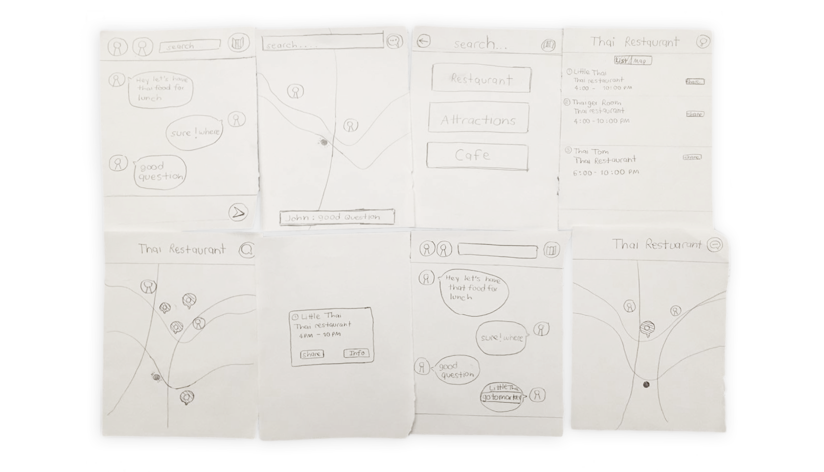
Based on the research results, we discovered that pricing, rating, and distance are the main components that help users decide of the place to go. So, we did iterate our design by adding those information to the list view.
Wireframe and UI Design.
Interaction Design.
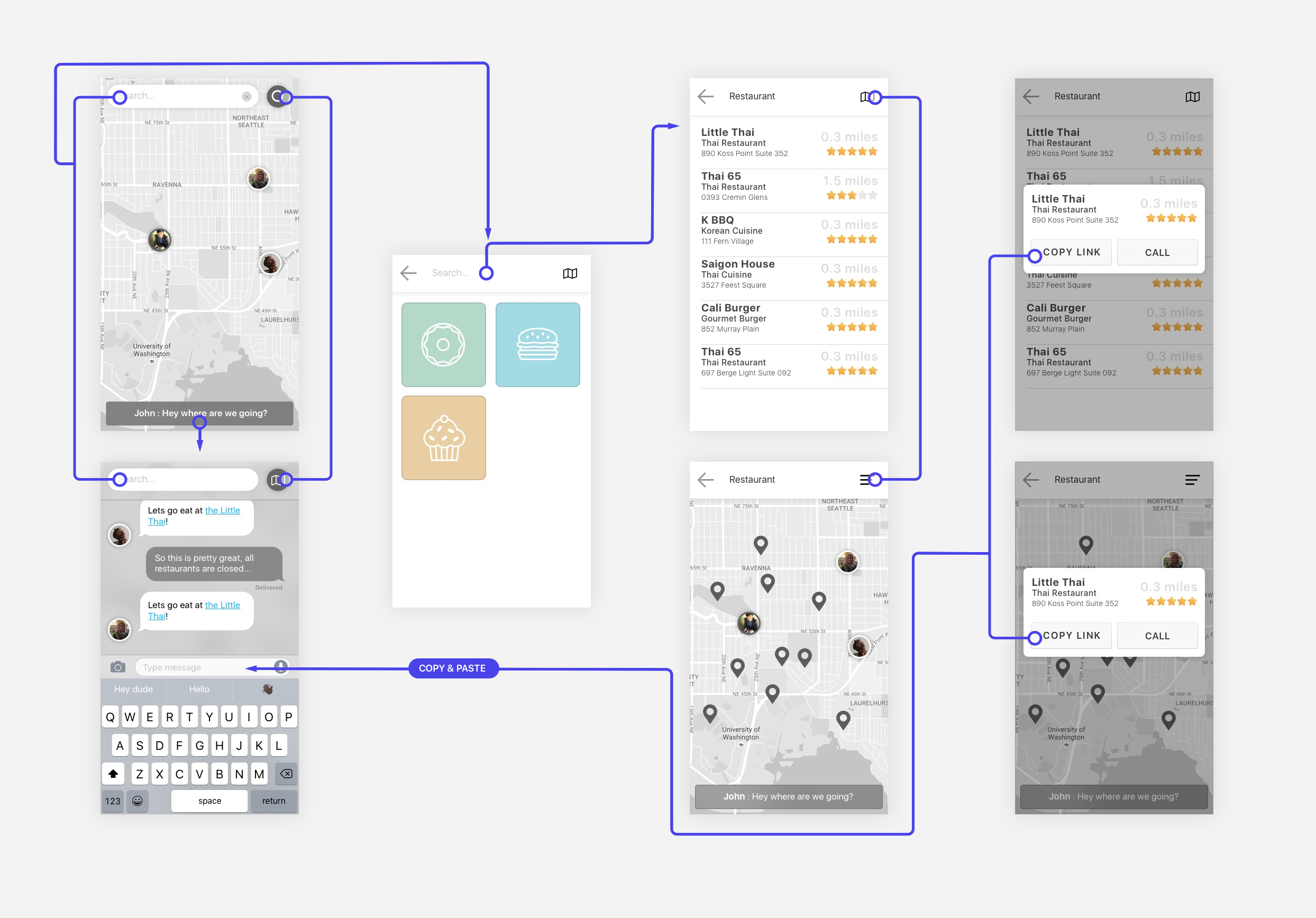
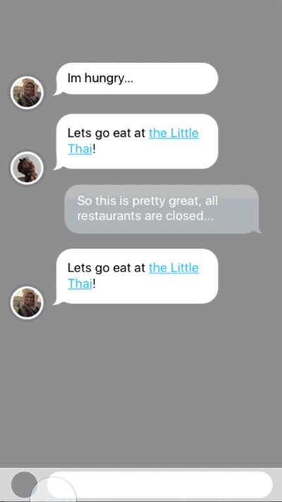
As we was designing the UI wireframe and components, we realized that the most important function of this app lies on the transitional interaction of chat and map. Using origami, Jihoon tested out different types of transition. With some external and internal design critique, we settled on an interaction which animates the map avatars to message avatars (very left image). This gave good hint at who was talking, and who was where.
Chat and Map Transition.
Chat and Search Transition .
Implementation.
This is my most favorite process. I love turning my idea into something real and see it is helpful and useful for others. For this step, I used React.js, Redux, Pubnub, and Mapbox to build the map-based messenger service.
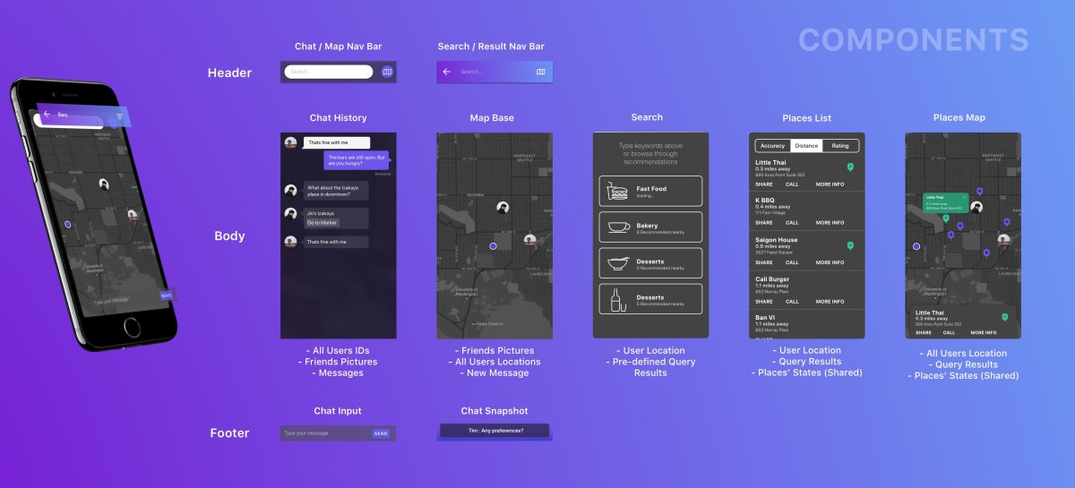
Breaking Down the Application
First Step of the implementation is to break the application into components. This step helps me understand how many components do I need for the application and which one can be reusable.
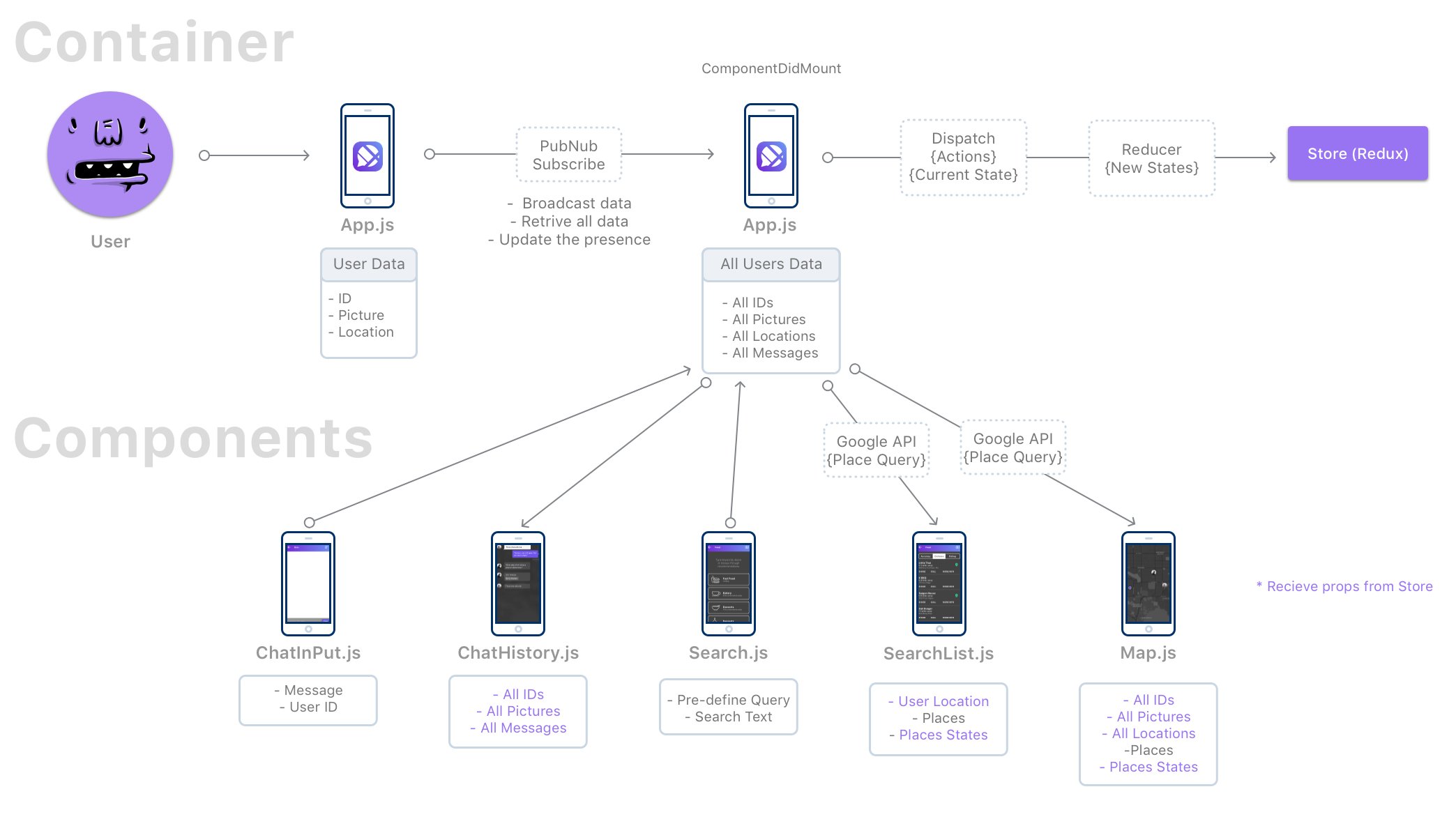
Application Architecture & Components
Then, I drew the diagram of the application states and data flow of the application to use as a reference while implementing. This chart can help me understand how my application works and which data should I pass to each components.
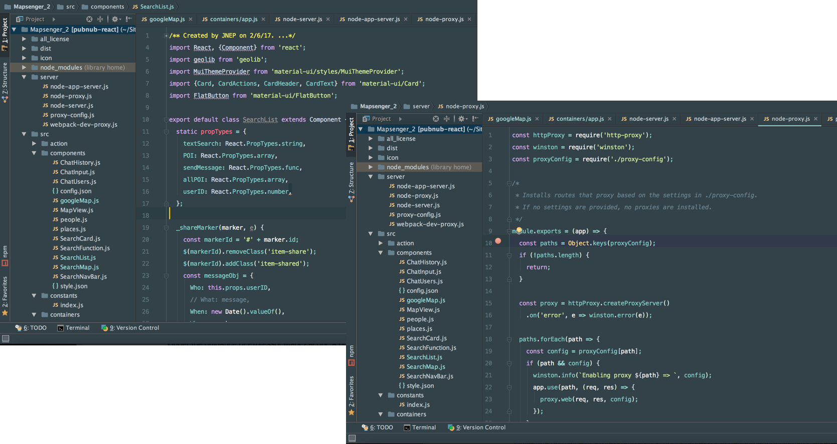
Transferring from design to code
I imported the design from sketch into zeplin to retrieve some CSS properties and use CSS Animation to create the interaction in the application.
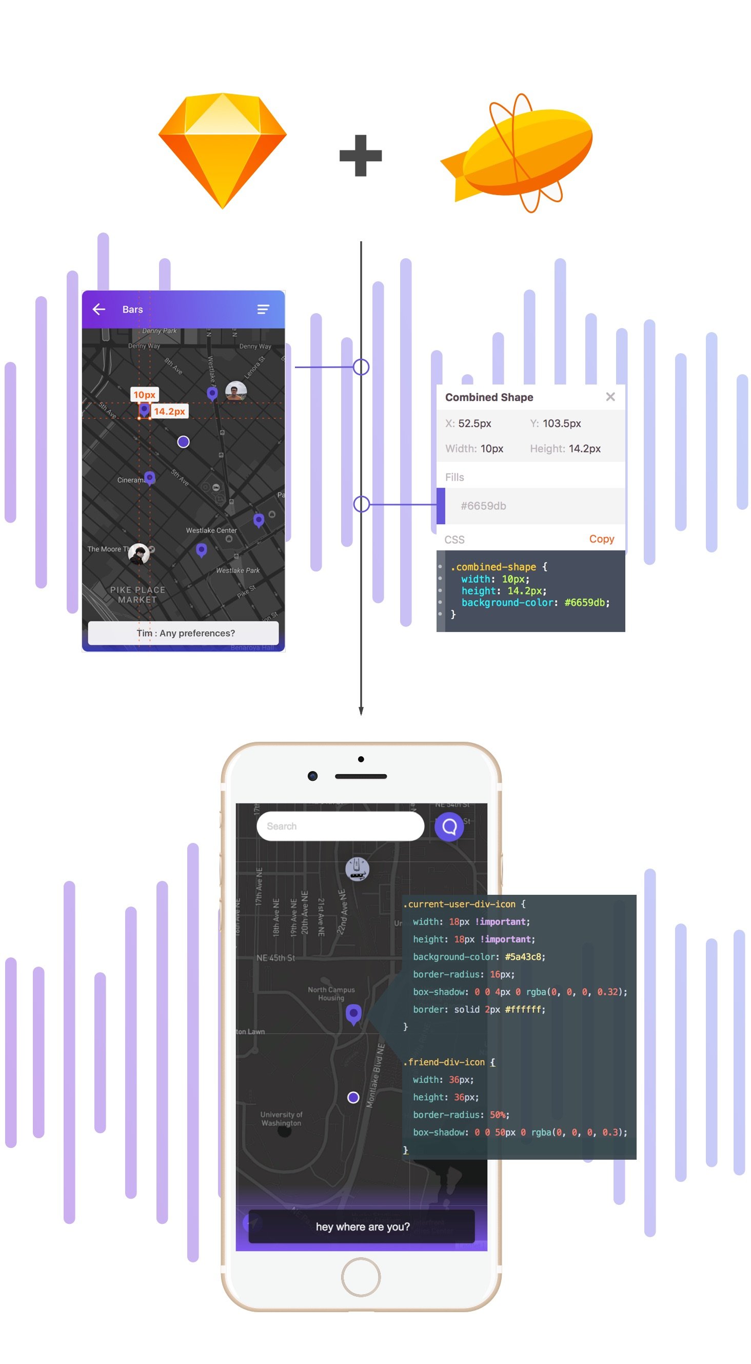
Interaction Design using CSS Animation
I used css animations to create animations based on Jihoon's high-fidelity protoype in origami studio. Here are the interaction design we have in mapsenger.
Transitional Navigation I
Transitional Navigation II
New Message Popup
Final Deliverable.
Reflection.
Key Learning
- Decision making process for informal meeting could lead to a non-democratize process. When users started to get tired of discussing and asked others people or choose one person to make the decision.
- Designing and Implementing the application actually go hand in hand. Some interaction design or animations requires more development efforts which might not have significant differences or create significant impacts on user experience compared to the animation that required less development effort.
- We should design the UI in grayscale first before adding colors to the interface to help us have a better judgement of information and feature hierarchical order.
What went well
- Users were excited about the product.
- We tried to improve the situation and existing issues that happened in everyday lives. People are encountering this issue and getting used to this issue without realizing the problems which we noticed and tried to improve upon.
- We should design the UI in grayscale first before adding colors to the interface to help us have a better judgement of information and feature hierarchical order.
Skills I learned
- Learning CSS Animation, Flux Architecture, React, and Redux
- Learning Real-time web communication implementation
- Application Deployment through AWS
Next Step
- Testing the demo with users to measure the reduction of app switching and time that users spent on the process of arrange the meeting
- Creating multiple channels for group of friends
- Adding voting system or other features that could help maintaining the democratic process within group decision making